June 7, 2025
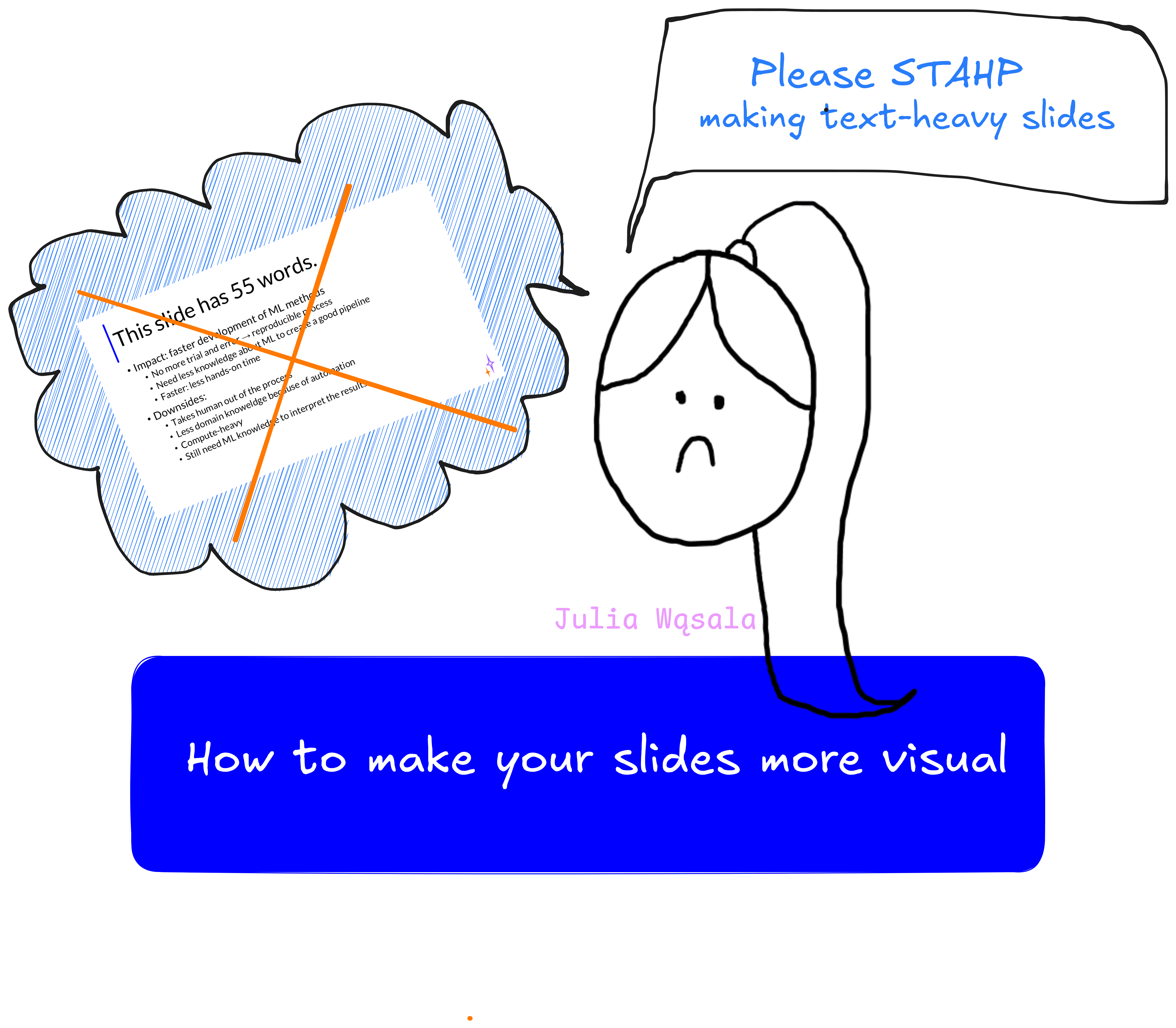
Many academic presentations have a problem. Logos and screenshots from the paper often are the only images we get – all the other slides are walls of text or bullet points with cryptic keywords. But why is this a problem? And how do you make slides more visual? In this blog, I share concrete tips on making your presentations more engaging with the effective use of visuals.
So this is where the story starts. As a PhD candidate assisting with computer science courses, I’ve graded many presentations. I repeated the same feedback, over and over again: use more images! Less text on your slides! Last year, I emphasised these points in the course instructions for presentations (and wrote a blog!). Barely anything changed. The text-heavy slides remained, now with an image added to the slide every now and again.
Students know use of visuals is a grading criterion. It’s not likely they’re intentionally losing points by refusing to add images. So what’s going on here? I think there are two culprits:
I address these points in this blog, and more! The outline:
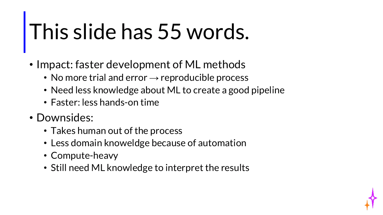
What is the first thing you do when seeing a slide with long text? My guess is: you read it. Look at the slide below. It’s a fairly average slide for computer science presentations; some even have more text. Reading takes more time than you realise. Fully reading the slide below takes about 30 seconds.
So what’s the problem? Isn’t it good to repeat your message in different media: in writing and in spoken word? Well, not so much. Reading requires concentration. When your audience reads the slides, they are not listening to you. So if you’re just repeating the words shown on the slide, you’re losing valuable time and focus from the audience.
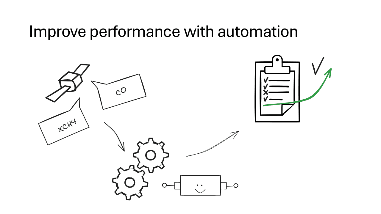
You should be the star of your presentation, not your slides. Your slides should support and enrich your talk, not distract. Visuals achieve this more effectively. Look at this slide:
Even though people say, ‘An image says more than a thousand words,’ you’ll notice that a visual slide doesn’t always convey more information than a text slide. The visual slide above only addresses a part of the text slide from earlier. But often that’s good: we don’t want to overwhelm the audience with too much information. If you can’t visualise it all in one slide, that’s fine. Just split it. It’s another way visuals help make more effective slides, because we can’t cram as much in a single slide as we can cram words into one.
OK, so text bad, visual good. But what exactly are visual slides? There are probably more ways than you think to include visuals in your slides. I'll explain different types and show examples from a slide deck I made for an upcoming conference presentation.
The first category of visual slides are slides with photos and visuals. I don’t just mean: adding a picture to your slide. Your whole slide can be an image! Though using photos and illustrations is not super common in computer science, here are a few ways you can use them (for instance, outside of academic presentations):
Here’s an example of how I use an image to add some comic relief to my presentation. I added an image of me at the start of my PhD to joke about how I never expected my first research project to take so long…
And here’s an example of a hand-drawn illustration, showing that I had to take a few steps back in my process and return to data exploration.
Diagrams! We researchers love diagrams of our methods. Many of us put them in our papers. Diagrams can be great ways to visualise a process, but beware of making them too complicated. Don’t simply copy-paste figures from your papers into your slides. Readers of your paper have way more time to parse and understand a diagram than the audience in a presentation.
Also, don’t be afraid to draw simple diagrams. Maybe even hand-drawing, on paper or on a board. It doesn’t have to be a shiny designer illustration. As long as it gets the point across.
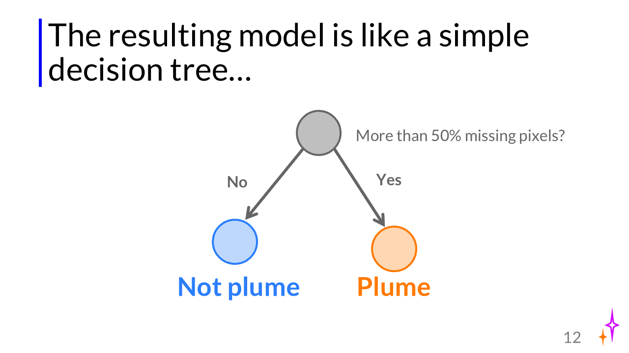
Here’s another example from my conference presentation, albeit a very simple one. I drew a diagram to explain how my model was behaving before applying my new method:
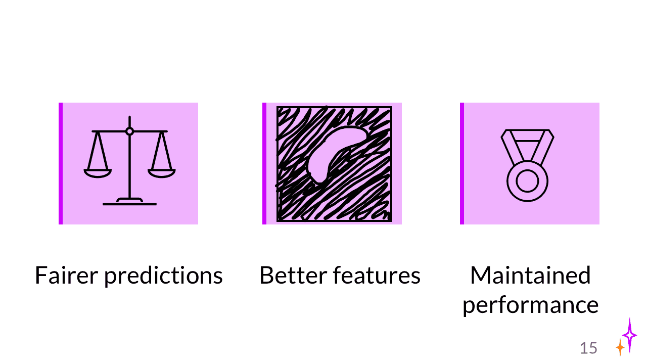
A ‘visual’ slide doesn’t mean text is completely forbidden. Icons can be a very effective way to add visual elements to slides that are otherwise text-only. Here is an example from my conference presentation. I chose not to show actual results, but to summarise them with icons (one of them hand-drawn).
Another one you probably didn’t think of: you can also arrange your text (boxes) in a smart way to convey a message without using words. This ties into visual concepts, or how we interpret visual information. For example, things that are displayed close together are interpreted as a group, while things that are far apart are perceived to be very different.
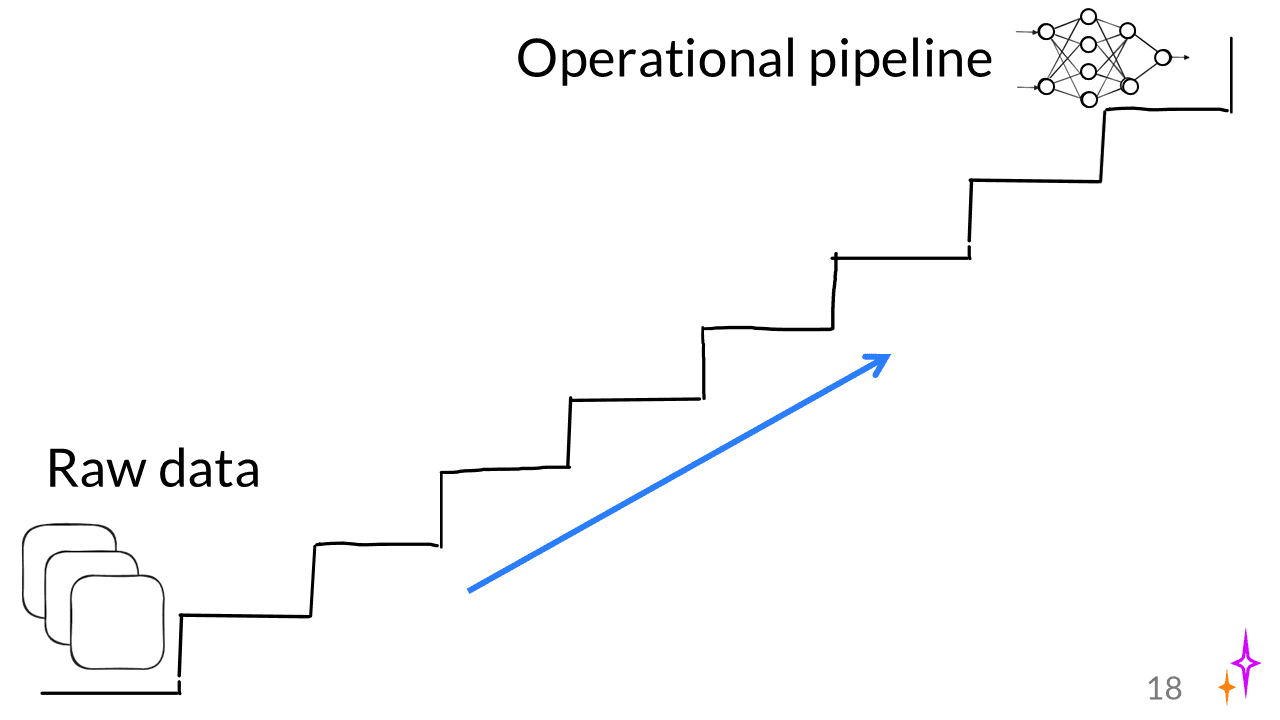
See the slide below: I use a simple drawing of a staircase to show that there are many steps between starting with raw data and producing an operational Machine Learning pipeline. You don’t even need the little icons/drawings here; just the text and the staircase could be enough.
Quantitative results are the core of many academic presentations. Most of the time, these are the ‘free’ visual elements we will have anyway. But we can make them more effective. Here, the same rule holds as for diagrams: be careful about copy-pasting things from your paper. It’s very easy to overlook how much context you need to provide for people to understand what’s in an image. Also, the font size on the axes in print is often not large enough for presentations.
You have a few options here:
Let’s look at some examples from my conference talk.
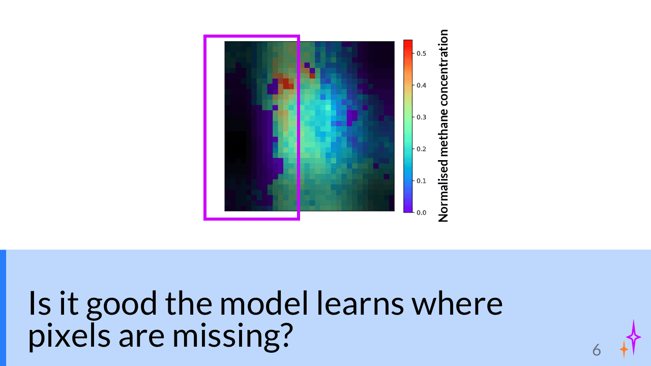
Use a box to point the audience to which part of the plot is relevant:
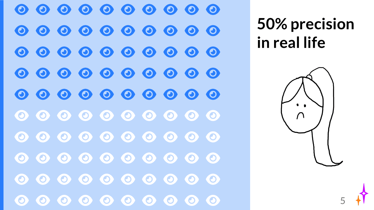
Display a statistic (precision) visually with a plot (made using this tool). I added the drawing as a comical touch and to indicate what I think about the results.
I hand-drew what I expected the results/data to look like:
If you want it to look cleaner, you can also just draw lines using vector tools (instead of the ‘draw on slide’ tool I used in PPT).
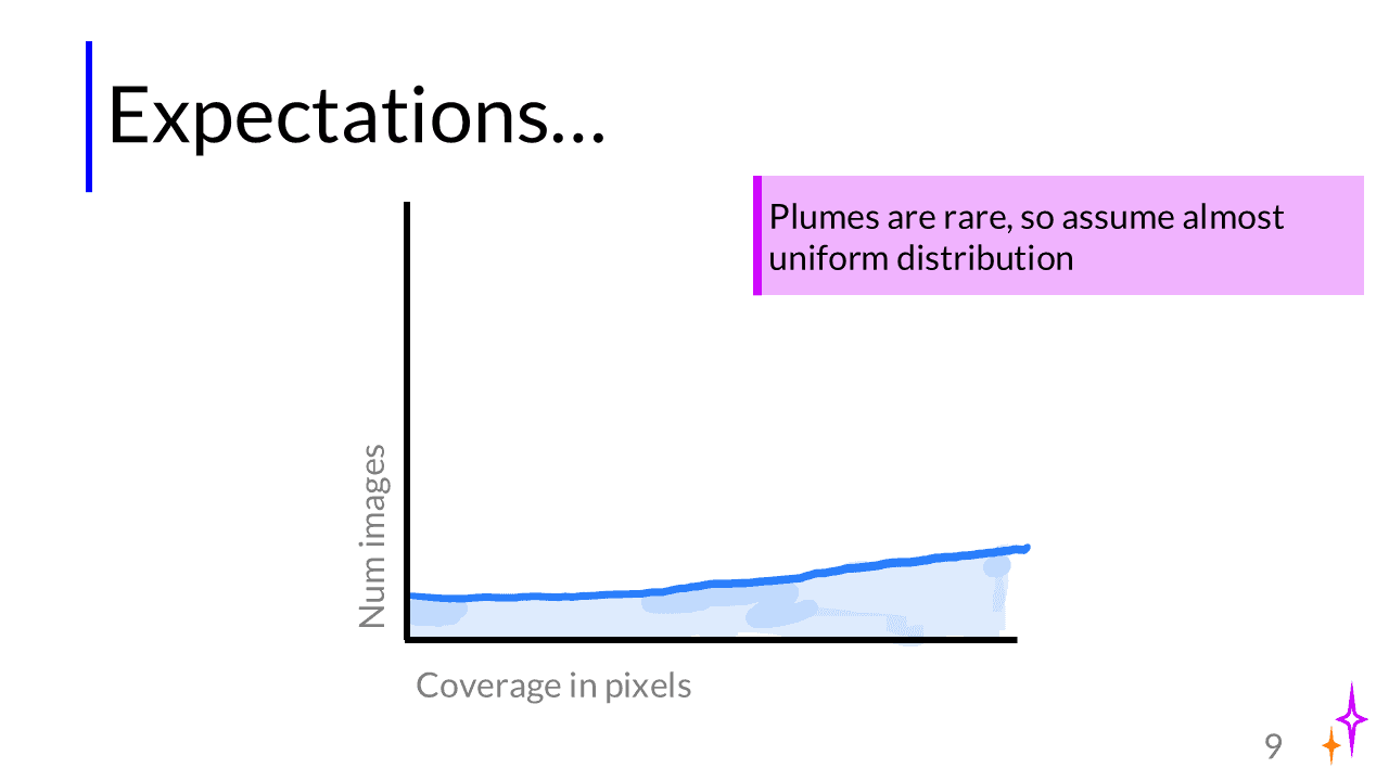
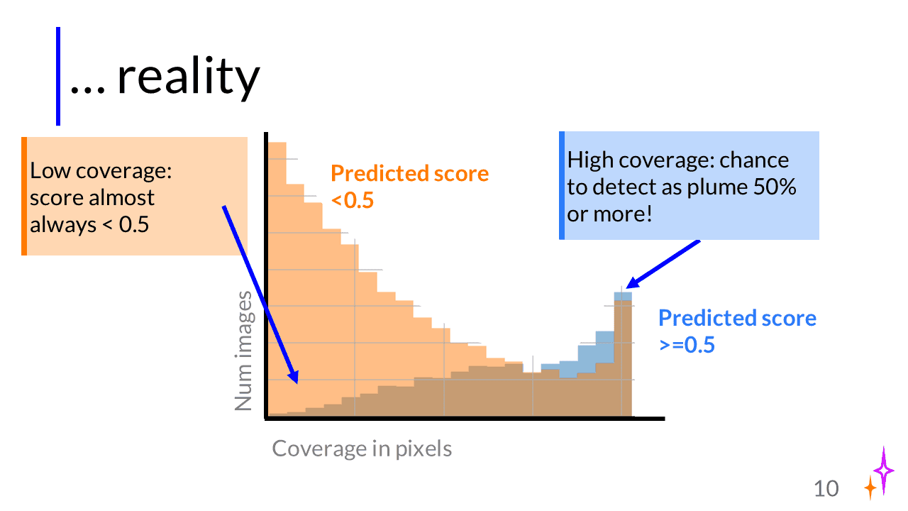
Here, I copied a plot straight out of an exploratory Python notebook. I removed small/unnecessary elements and added thicker lines and bigger axis labels in PowerPoint. Additionally, I added arrows and text to highlight the key takeaways from this plot. Instead of having a traditional legend, I used colored text (trick learned from matplotlib-journey).
Though it’s very memorable when somebody presents their research in comic form, not all of us are born artists (or have enough time…). However, drawings don’t need to be works of art or fancy to convey a message. As you saw in the examples, I use hand-drawn sketches when I don’t have an image or to add emotion to my slides. My people are just stick figures. I draw satellites as boxes with ‘wings’ to indicate solar panels.
If you don’t dare to put them on your slides, you can experiment with drawing concepts in meetings or on a whiteboard when brainstorming for yourself. I now frequently use drawings to explain problems or ideas to my supervisor and students I supervise myself! And check the resources to find examples of people who draw on their slides.
I showed you a lot of examples. But all of us have seen great, visual presentations and still struggle to design our own slides that way. (There’s a reason design is a craft/job in its own right….). So here are three strategies to make your slides less overwhelming and more effective for your audience, in order of increasing effort.
Ok, maybe this one is obvious, and not so much about making them more visual, but more about removing text. You rarely need as much text as you think. First of all, because not everything needs to be on the slide. Technical details like the number of runs or your learning rate don’t need to be on the slide, unless they’re crucially important. In academic presentations, the main job of your talk is often to get people curious enough to read your paper/thesis. So focus on what’s important: what problem you’re solving, what’s new about your approach. Interested readers can find all the details in the paper.
Also, not everything you say needs to be on the slides. Your slides aren’t a teleprompter. Visual slides can equally well help you remember which point in your story you are at. And it’s a talk, not a reading (I know it’s called that in the UK, which is confusing….), so it’s fine to only say something and not have everything in writing.
There are many different rules of thumb for word count in slides. At the very least, I’d never have more than 50 words, as in the first example. But I think an easier rule of thumb is to stick with a minimum font size, like 24 or 28, that is readable to people in the back of the room. If the letters are larger, there’s less space, and you’ll be forced to remove text.
‘Show vs Tell’ is an idea that is central to storytelling: in good stories, we don’t tell the audience that the main character is sad, we show what made them sad and how they responded to it. The audience can then conclude that the character is sad. It’s more engaging because the audience also thinks and interprets for themselves, instead of us spoonfeeding everything
This concept is not just important in fiction, but also in writing. When we write an academic paper or a blog post about our work, we can’t just say “Our method outperformed all 4 baselines,” we also need to ‘show’ this by describing concrete results from which the reader can conclude for themselves that our method is the best.
When I was at science communication summer school, we learned to alternate ‘telling’ and ‘showing’ to write a popular scientific article, which I used to write this general description of my research (in Dutch). After writing this article, I wanted to draw a comic about my research. I’ve tried to do that before, but always struggled to come up with an interesting storyboard because my research is fairly abstract. However, after writing the text with showing and telling, I realised that all the ‘show’ sentences made it super easy to design a comic, because I had already gone through the thinking work to coming up with examples for each ‘telling’ sentence I had.
So here’s the thing with making slides. Often we’re so focused on what we want to say (the ‘telling’, like, ‘my method is better than previous methods because xyz’) that we forget about how we transfer that message. Our slide deck becomes a list of abstract statements that are difficult to visualise.
So you need to let go of what you want to say a little bit, and think of different visual concepts that could convey the same message. I realise this is pretty abstract, so I’ll SHOW you some examples (hehe).
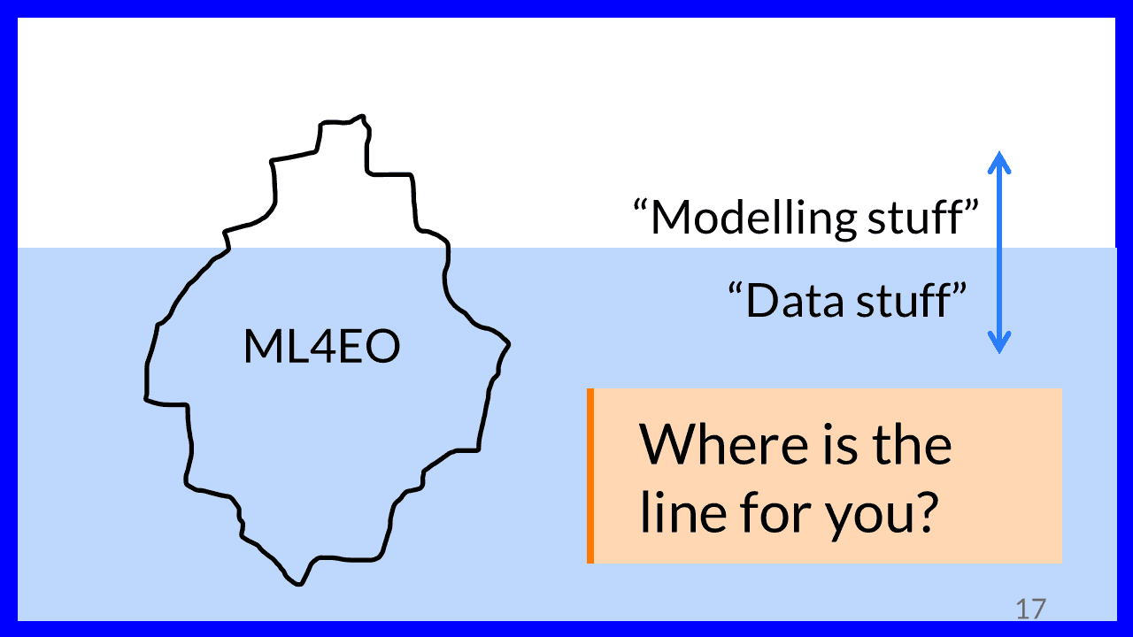
The iceberg slide from earlier: I want to TELL that I think most of ML4EO is actually fiddling with the data. I SHOW that by drawing ML4EO as an iceberg, with the ‘data stuff’ underwater.
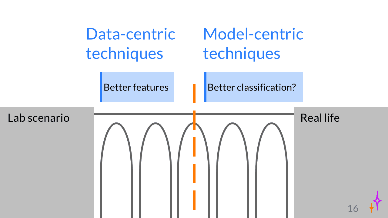
Another example. I want to TELL people that to solve the generalisation gap in ML4EO, we need to combine both data-centric and model-centric ideas. I SHOW that by drawing a bridge that has two parts:
As you can see, ‘showing’ can still be pretty abstract!
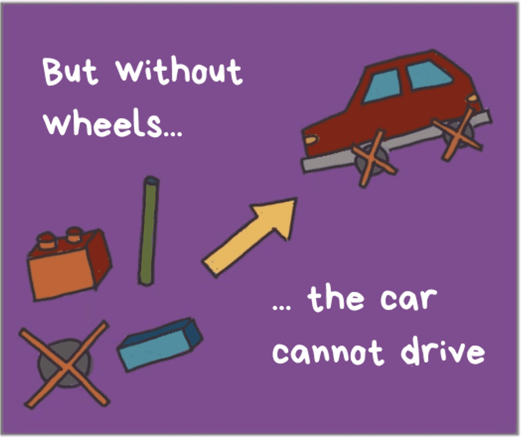
Here are two examples from my comic that are maybe more concrete. I show two challenges in designing AutoML models. 1: I want to TELL that without the right ML design choices in our search space, your AutoML model will not do well. I SHOW that by imagining a car-building factory that has no wheels:
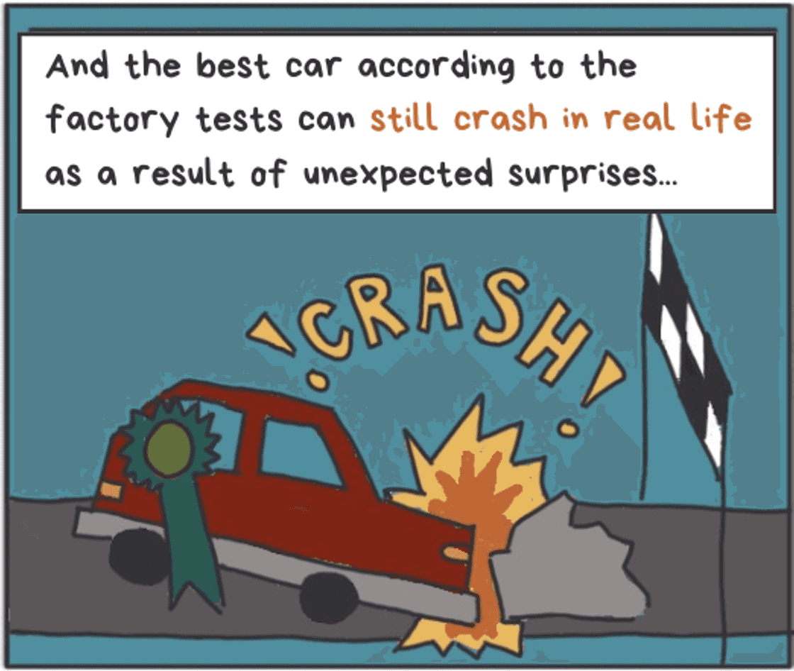
And in the second challenge, I want to TELL that even though our AutoML-designed model seems to do well on our test set, it can still break down in real life. I SHOW that by drawing a prized car crashing into a rock that unexpectedly found its way onto the road.
Coming up with ways to SHOW your message is both more difficult and easier than you think. It’s more difficult because you need to think about it. Usually, we don’t have these examples at the top of our minds. But it’s also easier than you think to come up with examples. For example, in a storytelling workshop, we were assigned a random object (like a box of pasta) to use as a metaphor to explain something about our research in only a few minutes. Everybody came up with something.
I would love to hear your feedback on whether this explanation clicks with you – I really want to help you make better slides, so I’m trying to find the best way to explain what I’ve learned.
Let’s be honest. Most of the time when we make presentations, we do the thinking and planning IN powerpoint. That’s how text slides are born: we write our thoughts, no filter.
But there is another ways. The last two strategies were applicable to slide decks you already have. The final strategy for making visual slides, the strategy I use, begins before you even touch PowerPoint.
I brainstorm my presentation on paper, on sticky notes, on a whiteboard, or in a digital mind-mapping tool like Excalidraw. Then, I talk myself through the presentation, WITHOUT ANY SLIDES, to check if the storyline makes sense. This is because I’ve realised that the outlines I write seem logical to me in writing, but feel unnatural when I deliver them verbally. Then, I rearrange my outline so that every bullet point is a slide. After that, I storyboard: I sketch my slides on sticky notes (quick sketches with a pen/marker). And only then, after all that, I open PowerPoint and make my slides.
I think these are the two active ingredients of my process:
In the brainstorming process, I already think about ways to ‘show’ my results. Then, in the storyboarding phase, I’m more or less forced to draw simple visuals because there just isn’t much space on a sticky note.
I concede that this process probably takes much more time than the way you make your slides now. I sometimes need multiple sessions spread over a few days to develop my ideas, and making a full deck of visual slides from scratch takes much longer than making text-only slides. This is why you need to plan; you don’t want to waste time making beautiful slides you won’t use.
Still, I think the results are worth it. Drawing things helps me think about my research in a different way, and visual slides also leave an impression on your audience. They’ll feel valued and respected because they see the effort you put into the slides, and they’ll remember you for it. But most of all, you’ll have a much better chance of connecting with them and getting your message across, compared to burying your message in text.
The three strategies I shared are meant as inspiration and concrete action points for you to start making more visual slides. They are by no means comprehensive. Here, I share more examples and resources if you want to improve your slides:
Here are my favourite tools for creating visual slides:
