July 1, 2024
Do you recognise this situation? Your mom asks you about your research. You start answering and realise you don’t know where your explanation should start. So, you recount anything you can think of related to your research topic. Your mom’s eyes glaze over, her mouth opens, then closes again.
She never asks you about your research again.
Dramatic, I know. But unfocused explanations do not stick. That’s the challenge with communicating science. We need to translate months or even years of work into something simple. How can we make sense of our knowledge and communicate the important bits to others?
In this blog, I’ll explain how you can make people remember your science. We’ll discuss:
We can communicate science in two ways:
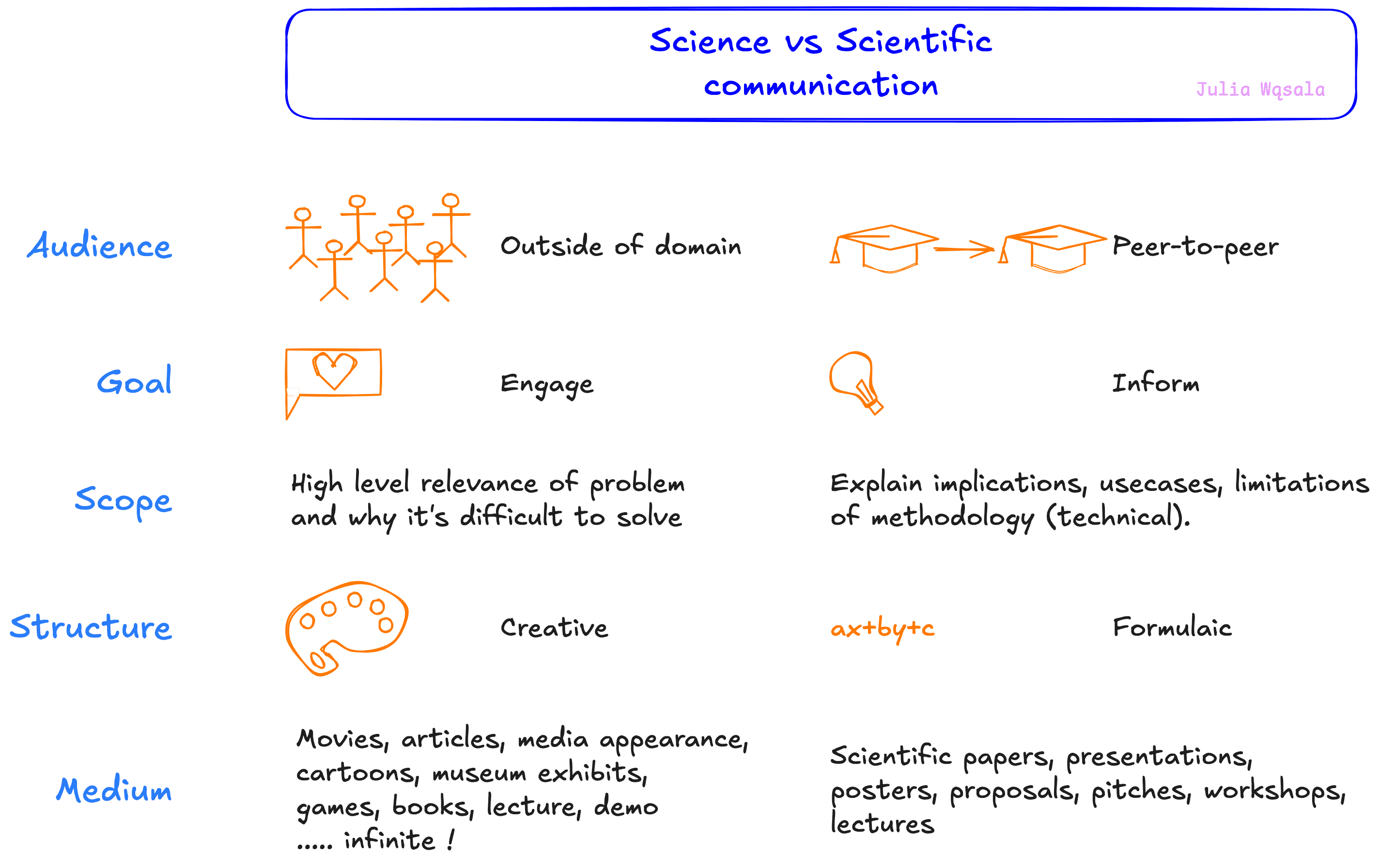
Science communication is when we explain our research to people who do not know a lot about your field. Your parents, your friends, or scientists from other domains. Researchers often call this outreach because we reach out to people outside our domain and engage them. As a result, we need to simplify our story. Concrete examples of the relevance of our research are way more interesting. So, avoid technical details and abstract concepts.
Science communication is all about finding creative ways to simplify difficult research problems. It comes in all forms, from serious to more fun: television shows, blog posts, pop science books, interviews on the radio, museum exhibits, infographics, and much more (Check out this blog for lots more examples of science communication).
Scientific communication is how scientists communicate with other scientists. It's peer-to-peer. We share what we learned in papers so others can build upon our work. Pitches, presentations, and posters make people curious about our papers. Proposals persuade people to give us money so we can eventually write a paper.
Scientific communication is very technical. The audience has a lot more context, so we don’t need to simplify or explain as much. Rigid rules like the traditional paper sections make finding what we need in a paper easier. We know where in the paper to find which information. As a result, scientific communication is much more formulaic than science communication.
Science and scientific communication have similarities, too. Even when speaking with our peers, we need to hack our knowledge into bite-sized pieces. Nobody knows as much about your topic as you do. And people need a story to follow! The concepts I introduce in this blog apply to science and scientific communication. I will call it communication from now on.
Preparing your communication is like designing experiments. It’s impossible to answer every question with a single experiment. We have to choose what we want to know and how to measure it. We don’t see those choices as a loss; we don’t think about the unanswered questions. We just focus on doing our experiment right.
We need that mindset in communication, too. First, celebrate the messages you can pass instead of mourning the ones you can’t. But we also need to plan how to deliver this message right to the audience’s front door.
A big problem with presentations by scientists is that we don't tell people how facts connect. It all makes sense to us, after all. That makes it hard to tell the central message apart from the facts in supporting roles. We need to do some work for the audience and show them the relationships between facts.
I love using communication frameworks to create those connections.
Communication frameworks are sets of rules or guidelines that help you organise information. For instance, Duncan Yellowlees (in his free email course about presenting), suggests these frameworks to structure a talk:
Communication frameworks help you figure out what to include or which topics to leave out. Moreover, the framework glues together your anecdotes and facts. The framework is a backbone that provides a logical, easy-to-follow order to your story.
There are frameworks for all kinds of modes of communication. What works well for a presentation might not work well on paper or in a poster. But some are more flexible. My favourite framework for explaining research problems is the ABT framework.
The ABT is a framework introduced by Randy Olson in the book The Narrative Gym.
ABT stands for “And, But, Therefore”. The idea is that you reframe your problem into a single narrative. It goes like this: background/context AND background/context BUT problem THEREFORE solution.
Randy's book contains many successful examples that follow the same structure. He also explains in detail how you can use the ABT. I'm showing you the simplest form.
Here’s an example for my research topic: AutoML for Earth Observation. Instead of BUT, I use HOWEVER, but it’s the same idea.
The satellites orbiting our Earth produce more data than we can manually process, AND there are many ML techniques, like neural networks, that can automate the processing of satellite images. HOWEVER, it takes a lot of time and expertise to design ML models for EO tasks. THEREFORE, we need to automate the design of ML methods so that domain experts can benefit from ML.
As you can see, the ABT imposes a specific structure on your message. A hierarchy tells the reader: this is the problem, the solution, the relevance.
When you do this the first time, you will want to add way more background context. Your message will be a string of ANDs. I like the ABT because it forces you to identify just TWO key factors (or facts) to understand ONE problem. This keeps your message simple. It helps you focus on your research and findings instead of getting lost in the details.
I use the ABT all the time. I use it when I brainstorm ideas or research a new methodology and need to summarise what I learned. Focusing my ideas also means focusing on the most important tasks, like follow-up research.
Furthermore, having a summary with a clear goal is very helpful. I sometimes get too caught up in secondary research questions or unexpected results. I look back at my ABT summary for research projects when I’m overwhelmed and confused about what to do.The ABT switches my focus right back to the main question.
I also use the ABT to define the scope of my talk or paper. An ABT is an excellent start for an introduction.
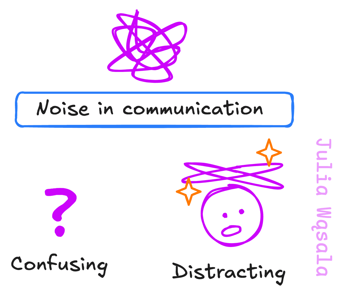
Noise is anything that doesn't stick to the message or is confusing or distracting. It’s like ambiguous sentences in writing. They stop our reading flow because we wonder what the author is trying to say. These doubts and questions are noise, like buzzing in the background. You want to reduce the noise as much as possible. Increase the signal-to-noise ratio, so to speak.
The idea of noise is easiest to explain with a few examples. Once I got the idea, I started seeing it in all kinds of modes of communication.
I got help from a coach to prepare a talk about my research for a general audience. I put lots of images in my slides: beautiful images from satellites and telescopes. The coach asked me to explain each image right away. Otherwise, people will wonder about every unexplained image instead of listening to you talk!
Figure and table captions in your paper should always have a conclusion. Figures and tables are part of the narrative you tell in your paper. They're evidence to support your claims. So, graphs have a specific purpose: evidence. Your readers won't know how to interpret them if you don't explicitly link them to your narrative. Write down what you can see in the graph, why it’s important, and which claim it supports.
Or a different case. Comments I get all the time are: “Why?” or “What does this mean?”. It’s not that my supervisors don’t know my research. They’re reading from the reviewer's perspective, who doesn’t have the same context as us, the authors. So when I’m vague or unclear, they point it out. Every vague comment or unclear explanation will confuse the reader. In the best case, it annoys or distracts them from your main points. In the worst case, it leads them to draw wrong conclusions or misunderstand your text.
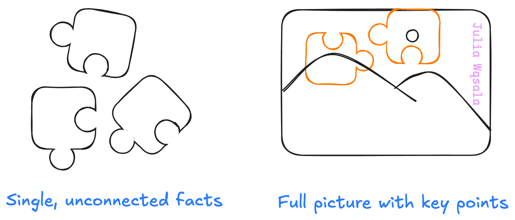
Part of what’s hard about communicating our research is that we worked hard to learn each detail and nuance. It’s really exciting when a new insight falls into place like a puzzle piece. We want to share that feeling with the audience. But we can’t explain the story of each puzzle piece or even what each looks like. We can only explain what the whole puzzle shows and maybe a few key pieces that we need to be able to see the whole picture. We need structure, and to reduce the noise.
Still, many scientists are sceptical about communication training. We have our scientific communication conventions. Even worse, the time spent crafting messages takes away from our time to do research. While this is true to an extent, our responsibility is not just to do research but also to share it with people who need it.
Communication about science has become much more complicated than 200 years ago:
More importantly, people's daily lives have changed. News and social media bombard us with more information than ever. So, if we want people to remember our work, we need to change, too. We need to work harder to share our work. Without it, your message won't stick out above this flood.
