June 2, 2023
I am always intrigued and slightly jealous of beautiful data visualisations in magazines or newspapers like the Scientific American or the New York Times. I love art and coding, but I was missing a dataset or idea to visualise. This summer I got the perfect opportunity. It was one of my supervisors’ birthday, and one of my colleagues had the idea to make him a nice PhD genealogy tree using data from the Math Genealogy Project. This post is a little report of my process, and what I learned along the way!
We needed to somehow get the data on the PhD student-supervisor relationships. I’ve never done any web scraping before, but I was saved by my colleague Jeroen Rook, who sent me the script he used to get the data for his own supervisor. This stage was really quick.
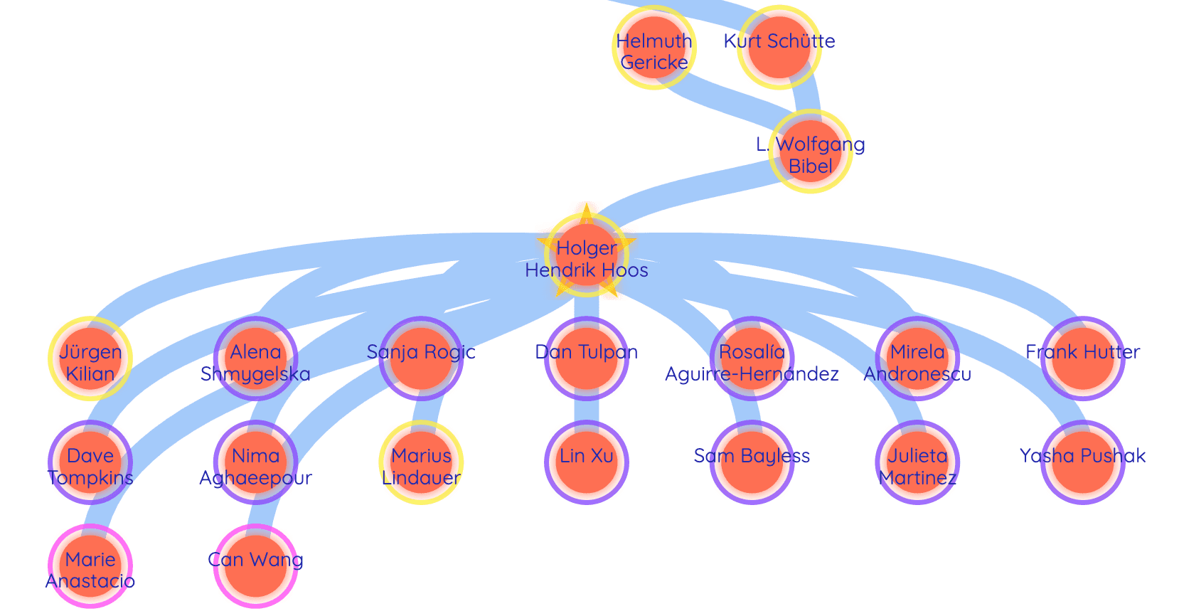
I made a Pinterest board with different ideas of genealogies, One of my personal favourites was this one of the Dutch Royal family. I thought it would have been funny to put our supervisor’s car on there instead of the golden carriage. I shared these options with the students involved in the little surprise. We decided that a simple design would please our supervisor the most.
I had a little bit of an idea of what I wanted to do: I wanted a nice tree, but also a little bit of extra exploration of the data. The Math Genealogy data had all kinds of extra information like year of graduation, country, university and PhD thesis title. Apart from the tree, I wanted to show the variety of countries and universities and maybe also do a word cloud or extract the most common words in the thesis titles.
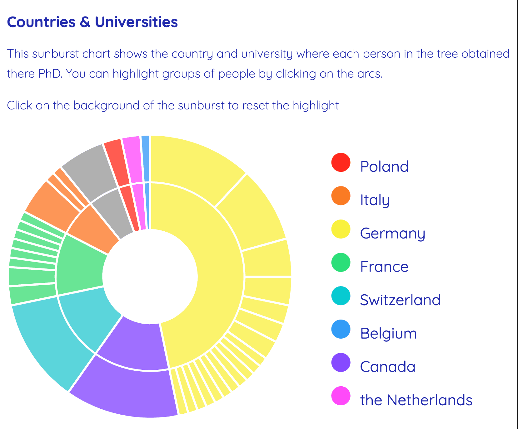
The thesis titles were in many different languages, so I dropped that idea in the end. I decided I wanted to make a sunburst chart for the countries & universities.
I thought it shouldn’t be that hard to make a genealogy tree, there should be plenty of people that do that. Boy, was I wrong, because I spent a lot of time trying to find examples of where multiple nodes depicting people can have multiple parents. Once I found the example, there was quite some fiddling around to get the nodes where I needed them to be. I won’t go into the nitty-gritty details in this post, but feel free to reach out if you want to know more.
Here are the rough steps I took to order the data:
There were still some PhD students of our supervisor missing. A master's student in our group helped me to add them to the data. There were many of them, so I positioned them manually instead of letting D3 figure out the position using force.
I also had to do some data cleaning in this part. The data actually went back way further, but there was less information about these people, so the top of the tree was more like a long snake. I cut off this part and Googled people with very long names so I could change the names to shorter, more manageable versions.
Much, much later I realised that compute graphs (like the one Dask makes) are actually very similar to what I needed for the tree. That knowledge could maybe have saved me a lot of pain, but maybe I’ll try it in the future if I ever feel like refactoring this visualisation.
The final sunburst.
After the tree, this part was very fast and quick. I used a D3 tutorial and was able to quickly adapt it to my data and style it the way I wanted.
One of the big reasons I wanted to learn to make data visualisations is that interactivity is so cool. So I was definitely going to add some here.
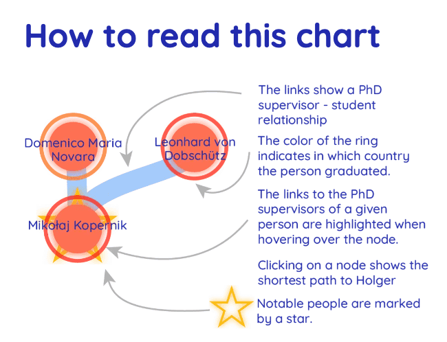
For the tree, I added a hover effect that shows you the supervisors of a person when you hover over them. I also used Dijkstra’s shortest path to calculate the path from an ancestor to my supervisors and highlight this when you click on an ancestor.
The most complicated interactivity to implement was highlighting people who graduated from a certain country or university when you click on the corresponding arc in the sunburst. The complicated part was that you needed to communicate between the two charts, but it didn’t go as badly as I thought it would because I have a little previous knowledge of JavaScript. I’ve also had a fair amount of struggles with the tooltips of the sunburst, but I’m really pleased with how they turned out.
The "Germany" arc is selected, and people from German universities are highlighted.
The last steps were to add some text and explanations, make a legend in Adobe Illustrator and make sure everything was where I wanted it to be. This took more time than was probably necessary because I just don’t know that much about web development.
Surprisingly, most of the lessons I learned were when I was tweaking my code to get it to work on my website. First in plain JavaScript for my Jekyll website, then in React for this one. First of all, D3 is not super readable. Though it’s convenient to define a lot of styling inline, it is much less buggy to add CSS hover selectors than handling hover styling with D3.
For a while, I was also a bit confused between HTML attributes and CSS because the syntax is so similar in D3. These things, as well as the positioning of elements in the DOM tree, became much clearer to me once I started moving things to React.
The legend I made in AI
I really like how easy D3 makes it for you to transform data. In Python, I’m very used to converting data between different data structures yourself, but D3 can do a lot of that heavy lifting for you.
I think that in the future, I will try to use D3 only for the math/ data transformation and animations, but leave as much of the other things to React and CSS. I also want to start using TypeScript again - it can really help avoid a lot of stupid bugs, but to be honest, I was lazy and I didn’t feel like doing too many new or forgotten things at once.
Finally, I was very excited to start as soon as possible with the D3 part, but I think that next time I will do some more data analysis to try and find other cool patterns in the data to visualise.
All in all, I am super happy with this visualisation. I had a lot of other design ideas that were a bit more complicated, but it’s probably better that I didn’t do it. I always want to run before I can walk. I know that it’s technically a good idea to start with simple things first, but I like to struggle with complicated things. It’s not just ambition/perfectionism, but I just feel like I learn more this way. I think I will make the next project a little bit simpler, though, because it’s also nice to have the results a little quicker.


